
Promotion
Promotion for this show took the form of a few things - social media, pamphlets and “exhibitions”.Amy took charge of the social media aspect and ran our Instagram account (@hereliesadragonfly). Becca and I designed the pamphlets on InDesign and I handled the print aspects (in a manner not too dissimilar from my promotion for “exposition”). Jess and Jake handled the exhibitions.
Posters
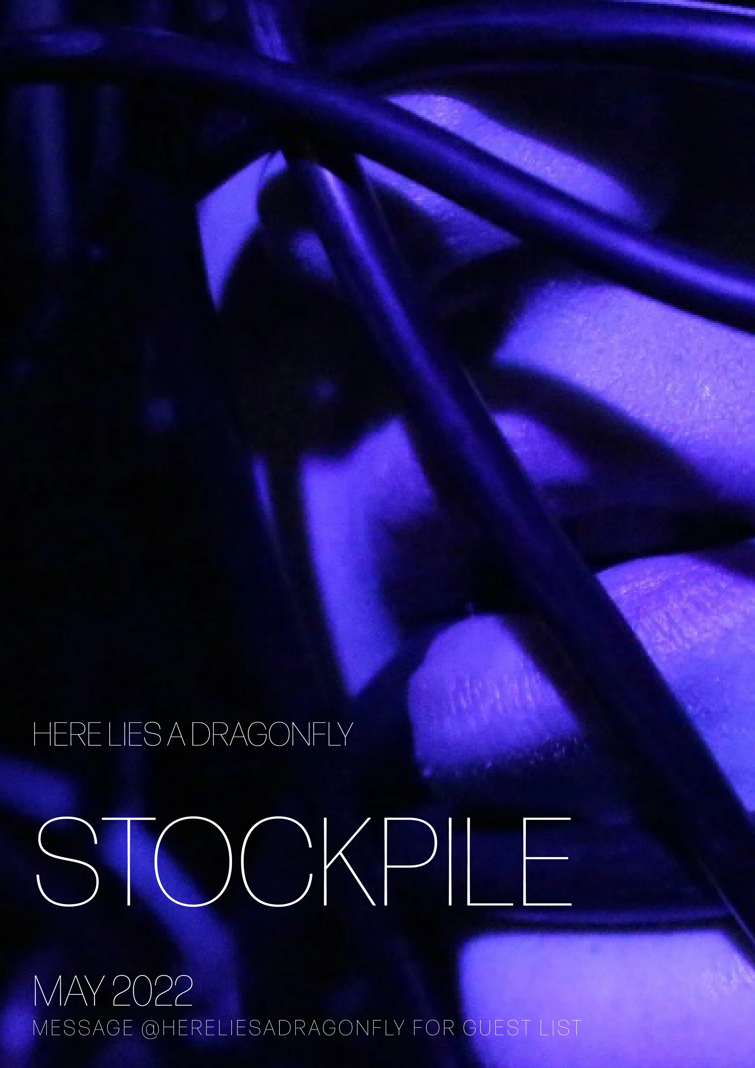
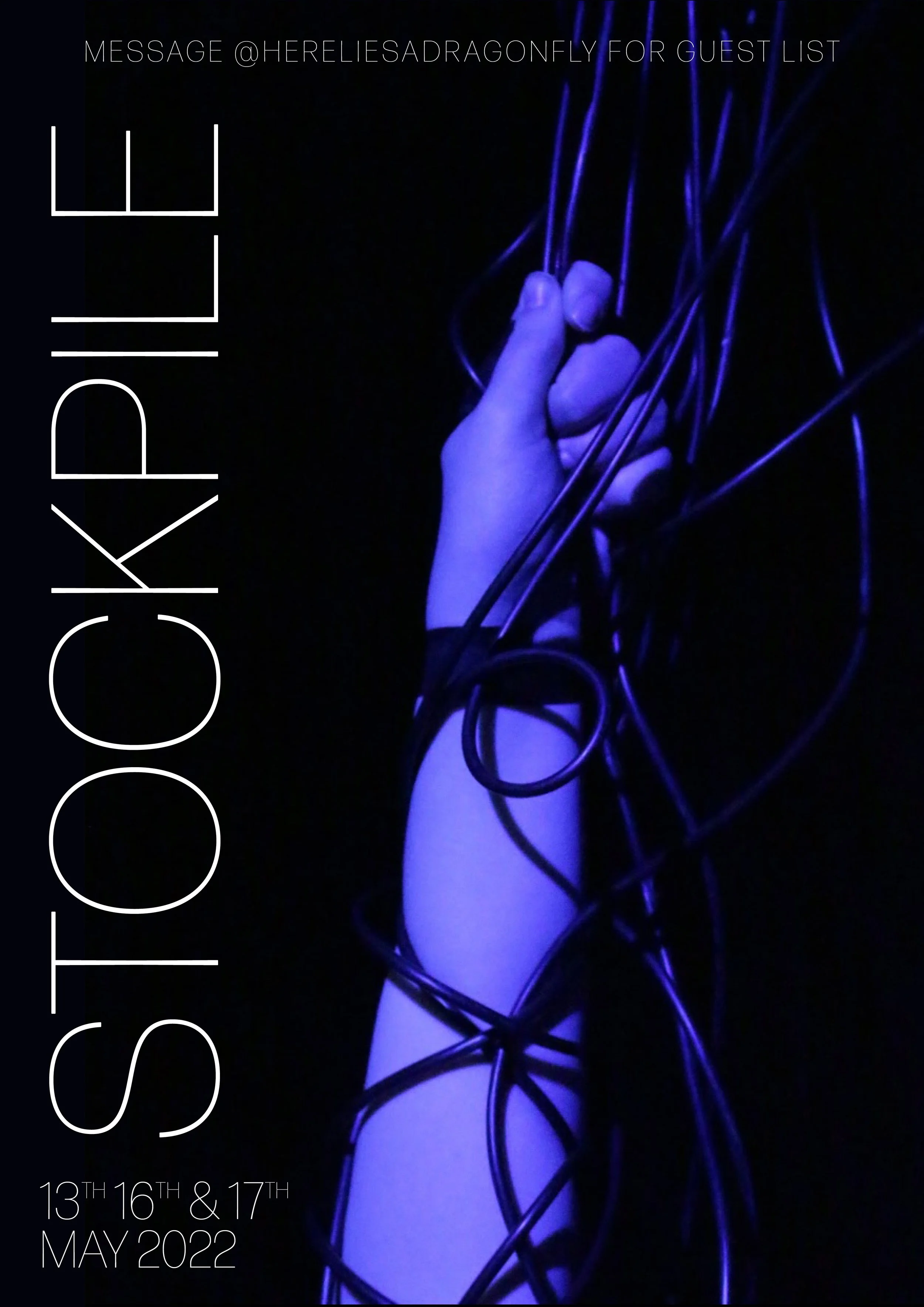
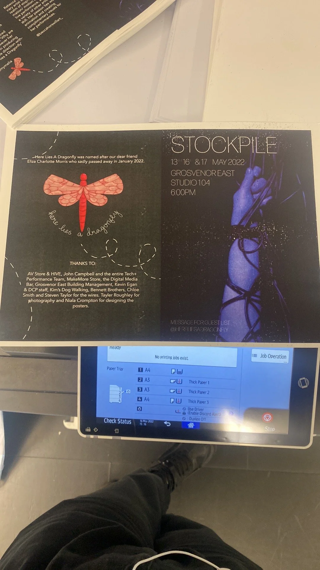
The photos for the posters were taken by Taylor Roughley. These were then made into posters on Photoshop by Niala Crompton. There were some issues and disagreements that arose from this as when they were printed out by the group originally the text was too dark (although they were much better looking on the computer).
I put myself forward to be more involved with the print side of things from this point because I had some experience from the exhibition and really enjoyed making physical items.
At the Digital Media Bar, I got some help and we changed the settings from RGB (which shows what it would look like on screens) to CMYK (which is what would come out of the printers) and I made some adjustments on photoshop as the colour looked much less saturated and less blue than intended. I bought the Inspira 300gsm paper from the MakeMore Store and got to work printing with the ricohs.
Whilst the A4 prints came out pretty nicely, the A3 ones were pixellated and since we had wanted A2 posters also to go through the wide format printers, there was no way of doing so and getting a high quality image. We got back in touch with Niala who sent the files again but unflattened (so the text and image were separate pictures) but unfortunately the image seemed too compressed. Whilst it was acceptable (but a bit on the fuzzy side) on A3, I knew we’d simply be wasting money trying to blow it up any bigger so settled for that.
Programmes
Originally we were going to do the programmes using Canva but decided to use Adobe InDesign instead as it would give us more freedom in the long run and was better suited for booklets. This was another learning curve for me as I wasn’t so used to it but luckily Becca was. As my task list was getting too long and I knew I couldn’t do it all (editing my films and making the programmes) on time, especially as I was learning the software as I was going along so we agreed to split the task - I badgered our group for information and headshots and did the layout on InDesign, using lots of placeholders and then I packaged the file and sent it to Becca to do the finishing touches (like font, backgrounds and colours).
We then hit our first hurdle - print costs were MUCH more expensive than the paper. Thinking about the possible cost to print them out for every showing, Becca made a QR code for the programme and stuck them to the walls to the entrance. After talking to audience members after our test run, we recieved feedback that many did not actually get a chance to scan as they were ushered in very quickly and the show began promptly (if not early).
As a result, I gave feedback to the group to ensure they’re not starting the show earlier than the run time stated and audience members should be let in earlier giving them a chance to engage not only with programme but also to appreciate the other non-perormance aspects to the piece - the pieces of card stuck to the seats that were remnants from Jess’ earlier exhibitions, to look properly at the set and pick out things from the tapestry we created, to actually view some of the films before the play began and the in person action naturally drew the audience attention away.
I also decided that instead of using the QR codes on the walls (or rather, JUST using it on the walls) - that I’d print them onto higher quality paper but “credit card” sized so the audience would be encouraged to take them with them. These were used for the first three runs (11/5, 13/5 and 16/5). For the final run we were to give out programmes to our invited guests.
First, I discussed with Jenny at the MakeMore Store what types of paper I wanted. Originally I wanted a more satin finish on the paper (similar to the paper I had used for the posters and for the exhibition for the Professional Practice unit earlier in the year). However, when asked for recommendations she suggested the cartridge 110gsm which Becca took a quick liking to. I had wanted the covers to be thicker and wanted to use cartridge 210gsm for the outer covers.
Unfortunately for us, all three ricoh printers in Chatham were broken leaving us having to go to Benzies floor 3 to print. As expected, we had a few issues with the print - the print would come out splotchy. Despite several asttempts at changing certain settings and even with the quality set to fine and the correct paper weight selected and the technicians at Digital Media Bar doing their best to help, we still couldn’t get a good enough quality print. As a result, we had to abandon our idea to have the covers thicker than the inside pages as it was becoming too expensive and print services wouldn’t be able to refund us in time to simply print again. Instead, all pages were on cartridge 110gsm.
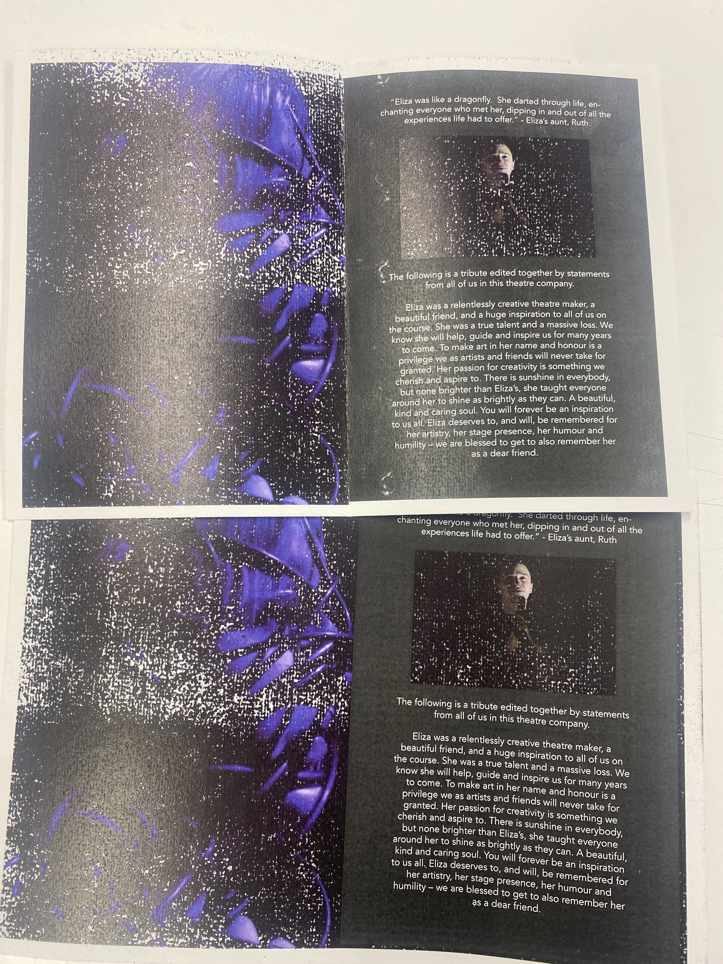
As you can see, the images come out with flecks of white where it hasn’t seemingly printed and it seems to affect the darkest sections most.
From there we went to bookbinding workshop and used the electric guillotine to trim down the pages. As always, there were difficulties and the guillotine kept giving us error messages. We persevered and had to power the machine off after every cut as it wouldn’t be able to be serviced until at least the following day. We cut the bleed marks off and then had to collate the pages. After that we used a bone folder to make crisp folds to the spine.
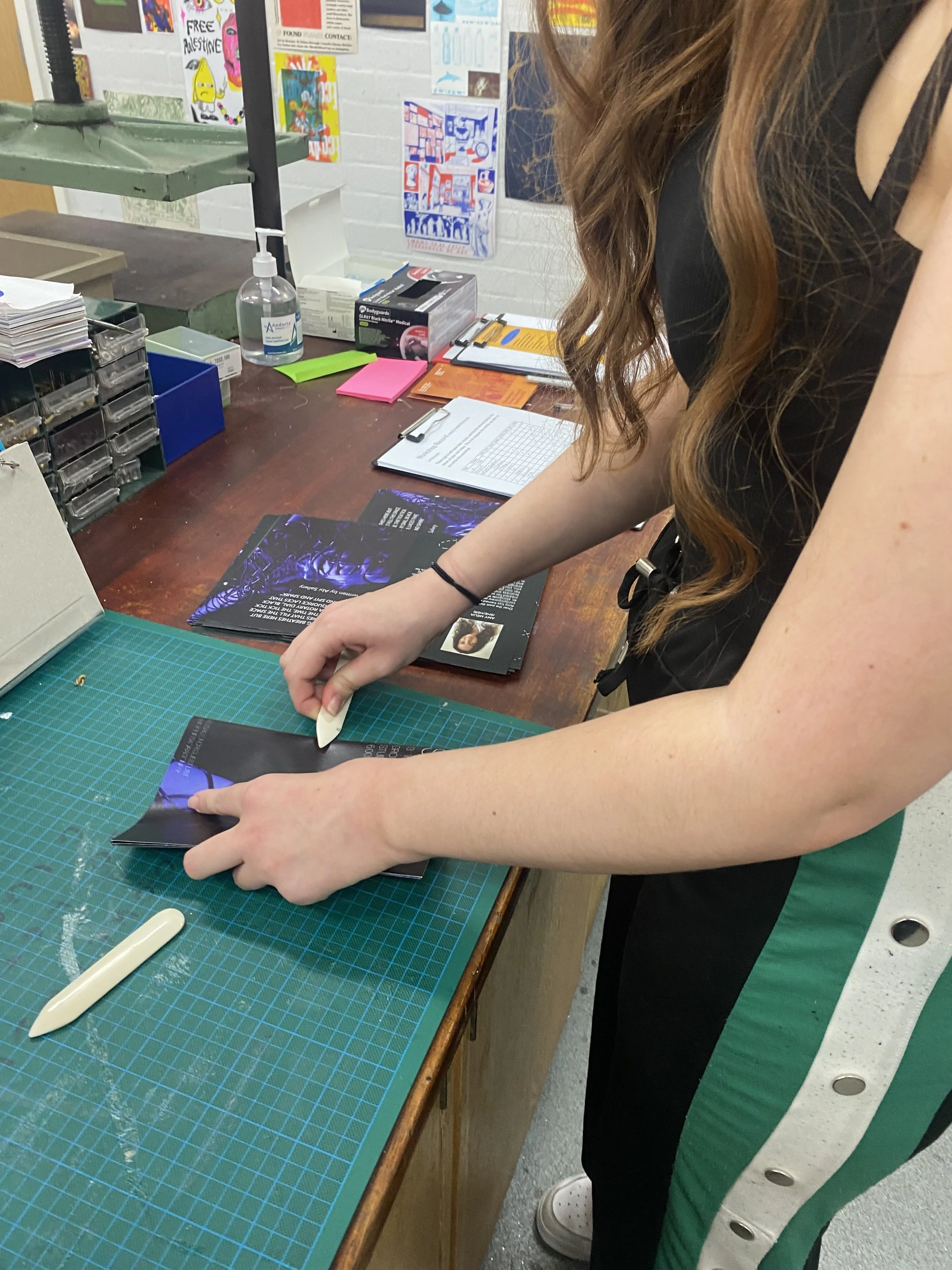
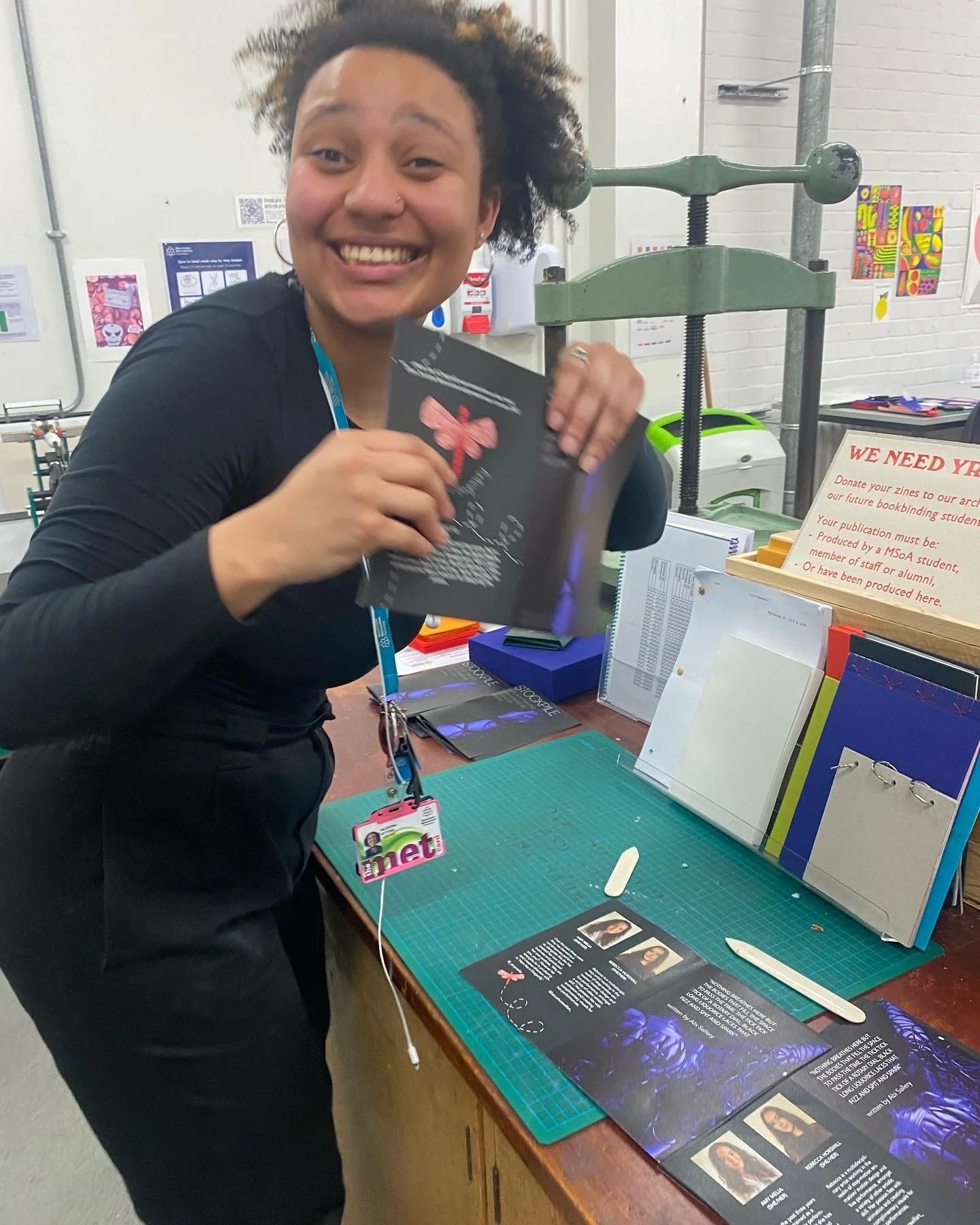
Following that, I had a quick induction on the stapling machine.
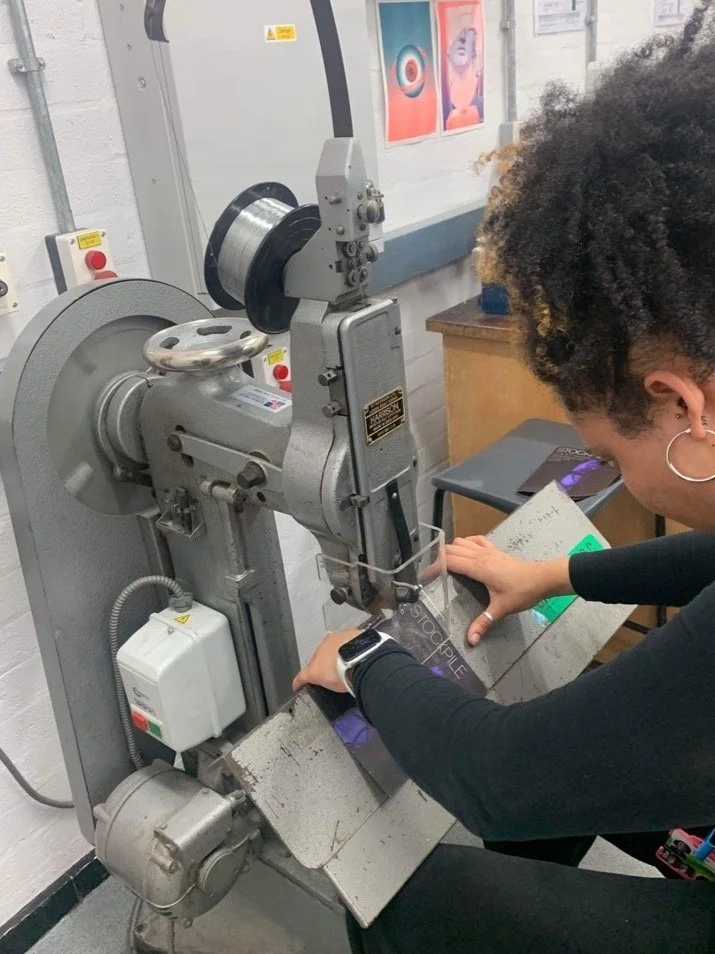
Before lastly going back to the guillotine to ensure all the pages were perfectly aligned - and then we were done!
Here is a PDF of the final product: Stockpile Programme